Disclosure: This post may contain affiliate links. I earn a small commission of product sales to keep this website going.
This question comes from one of our readers, Claude, who asks, “What are the key differences between Classic Chrome and Classic Neg?”
Happy to answer that, Claude, great question!
I first examined these differences when I got my X100V, along with some film simulation recipes for Classic Chrome and Classic Neg, here. This article will explore the differences in further detail now that I’ve had a few years with it.
Objective facts: Classic Chrome vs Classic Neg
Unlike some of the other Fujifilm film simulations, Classic Chrome and Classic Neg don’t correspond to actual Fujifilm film stocks. Classic Neg is loosely based on Superia film, while Classic Chrome is just a “look” to simulate chrome film stocks made popular in photojournalism in the latter half of the last century.
Classic Chrome was first introduced in 2014 in the X30 and X100T, while Classic Neg didn’t appear until five years later with the release of the X-Pro3 in 2019.
Looking at image comparisons, using the same image but processed with both Classic Chrome and Classic Neg, some immediate differences become apparent.
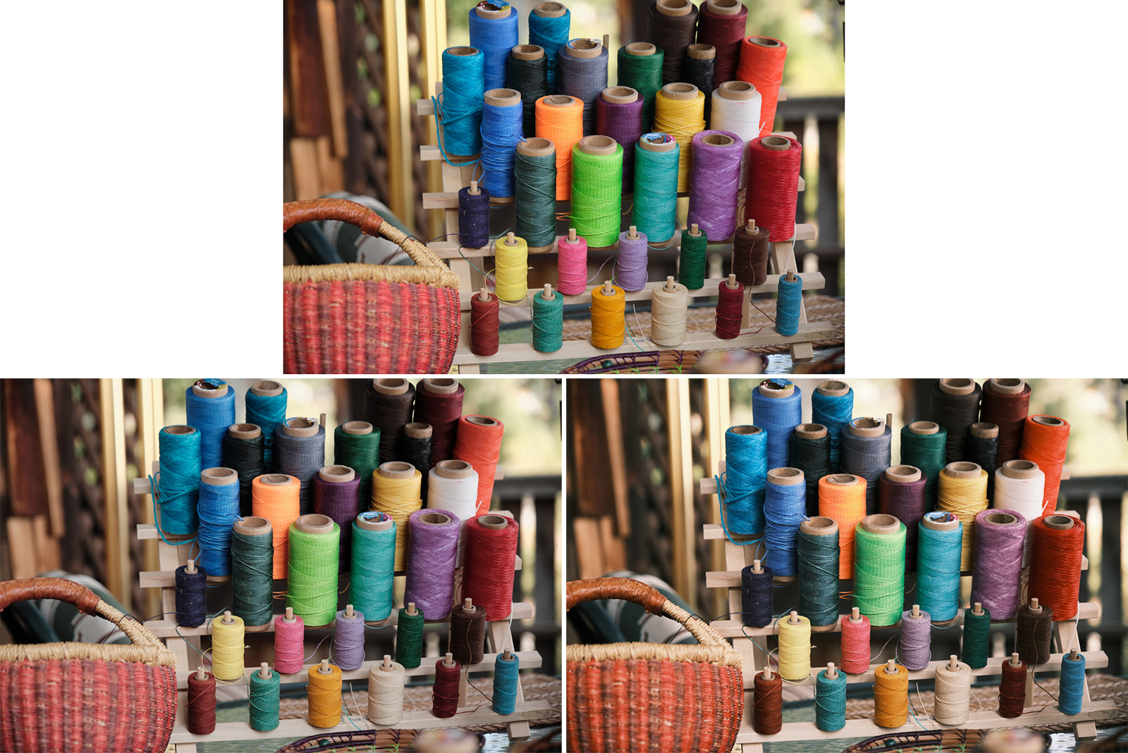
Colors
Perhaps the most obvious difference between Classic Chrome and Classic Neg is the color.
Classic Chrome is much more desaturated than Classic Neg, but not globally. Blues retain some vibrance and are also shifted in hue towards cyan. These characteristics give it that nostalgic “chrome” look and overall cooler characteristics.
Almost the opposite happens in Classic Neg. While it generally has a more saturated look, the cooler colors – and even yellows – are desaturated more than the reds and oranges, lending it warmer characteristics.

Contrast
If we use the neutral Provia film simulation as a baseline, both Classic Chrome and Classic Neg have stronger contrast. They’re quite bold. However, the tonal regions where these two film simulations have that stronger contrast are different.
While Classic Chrome has strong contrast in the shadows and more neutral contrast in the highlights, Classic Neg has very strong highlight contrast. Classic Neg also has different tone curve responses based on color, so you have additional contrast tweaks based on the colors represented. This can make predicting contrast a lot more difficult with Classic Neg!
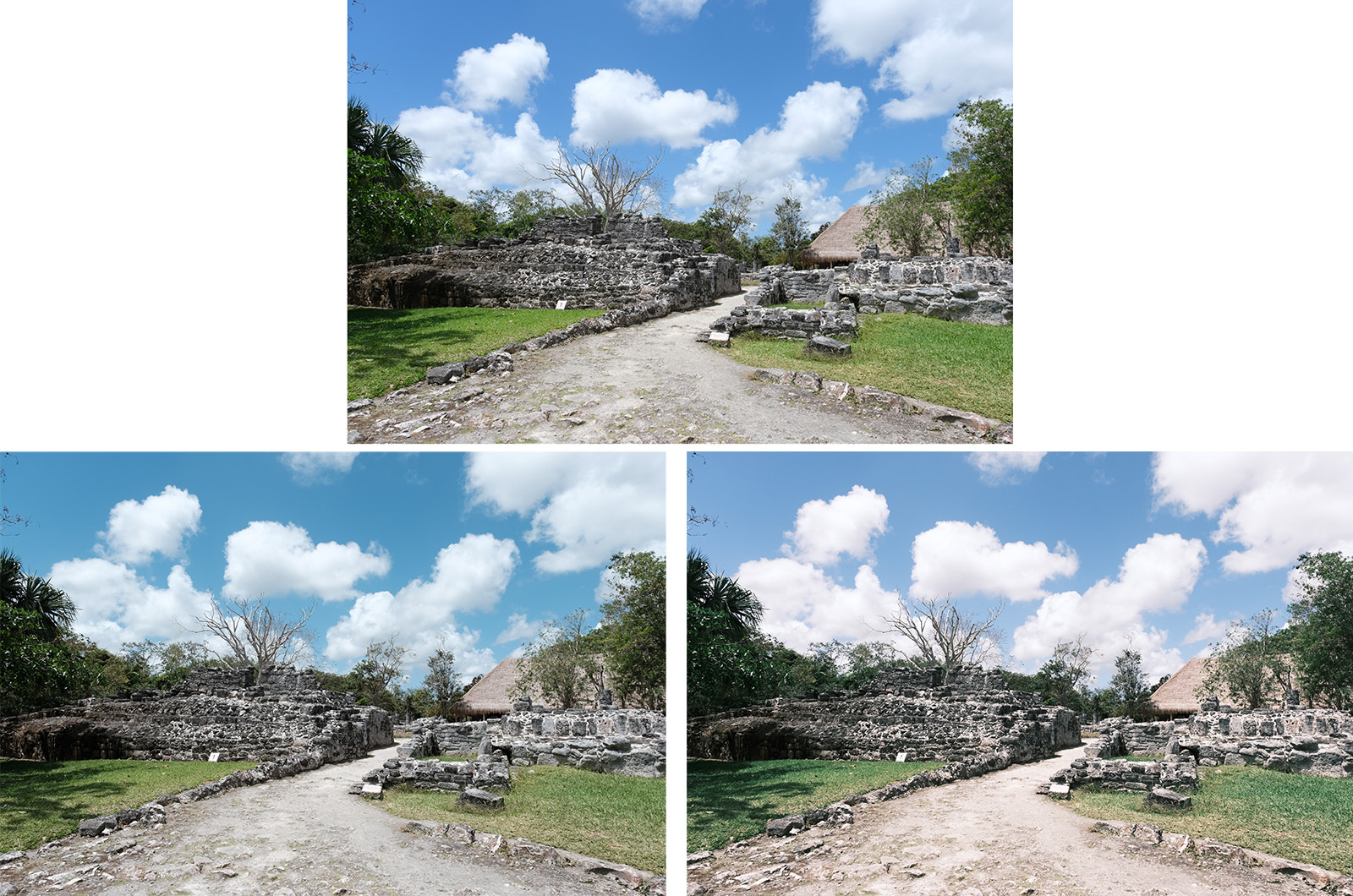
Subjective comparison: Classic Chrome vs Classic Neg
That knowledge background is nice, but what does it mean to us as photographers?
I think the subjective differences between Classic Chrome and Classic Neg are the more important differences to consider.
This is where it’s about feeling and telling the story you want to tell.
How we style our photos – the visual characteristics like color and contrast treatment – help our photos speak.
One of Fujifilm’s main advantages is that you can choose the film simulation appropriate for your story and process the photo in the camera. Understanding the style differences between Classic Chrome and Classic Neg and knowing when each one is appropriate will help you with that storytelling.
Consider the photo below, with Provia on the top and then Classic Chrome and Classic Neg below. Don’t the two feel completely different from one another? Don’t they tell different stories?

This was a cold morning. The photo on the left, processed with Classic Chrome, helps you feel that cold. Processed in Classic Neg, however, the feeling is much warmer, which is not what I want you to feel.
When color distracts from your story, perhaps because it’s too overwhelming or muddled from mixed lighting, going to Classic Chrome will mute those colors so your viewers don’t have those distractions. Be careful when using Classic Neg under the same circumstances, however, because the wild changes in hue, saturation, and contrast can exaggerate those color distractions even further.
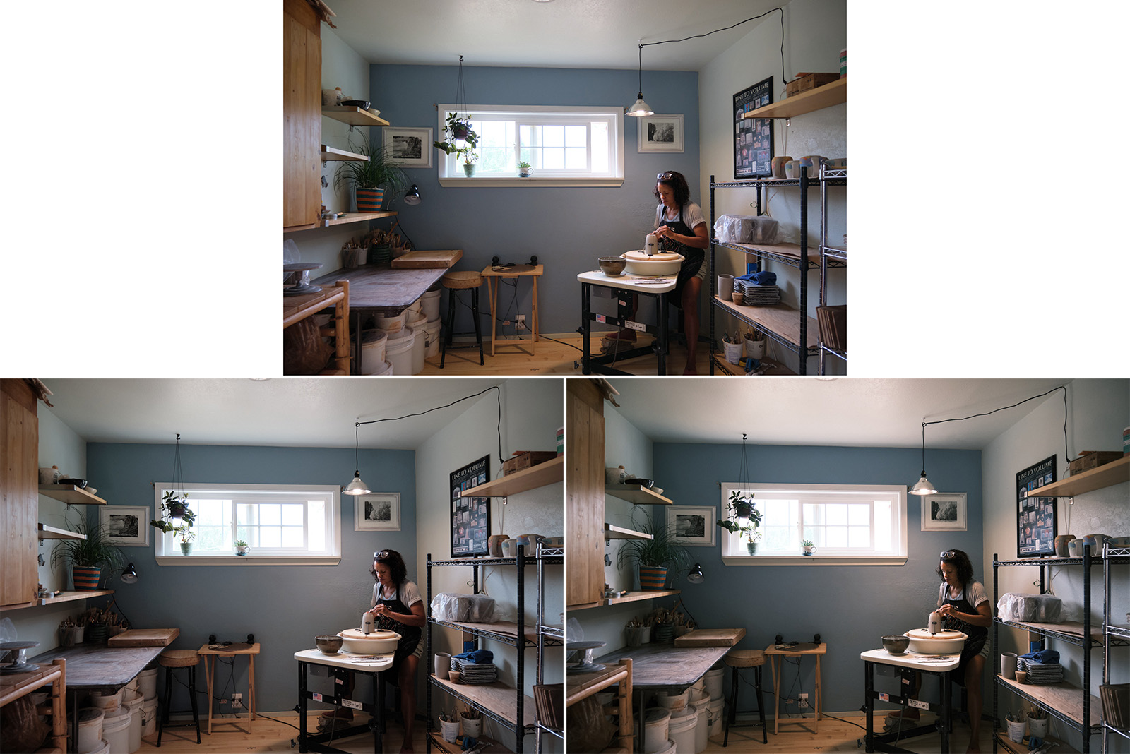
Photographing people on a bright, sunny day? Classic Neg will, as mentioned previously, create an overall warmer and happier feeling. If the scene’s mood isn’t warm and happy, however, maybe Classic Chrome is a better option to tone it down.

Perhaps you’re going after a more nostalgic look. Both film simulations can serve that purpose but with different feelings.
How will you use Classic Chrome and Classic Neg?
I hope this comparison helped you gain a better understanding of the differences between Classic Chrome and Classic Neg. Being deliberate about the film simulations that you use can greatly improve your photography and alter your viewers’ emotional involvement in your photos – for better or worse.
This was a fun comparison, I’ll do a few more 🙂
In the meantime, you can check out my free Learn Fujifilm Film Simulations course, which includes a few videos, a PDF download, and a quiz.
